Franciscus
My interest in typography predates my rabbinate. Long before I came to my first pulpit, I messed around with letterforms and typefaces, as if I were preparing for a career as a typesetter. Something tells me I would have been happy in that field. Many of my best experiences—the most stimulating and lively—have been in filling blank surfaces with ant tracks of text. Many type nerds would say the same.
Oddly, the rabbinate gave me new opportunities. I was the one who set the type for our newsletters. I worked on announcements and invitations—the whole paper program of the Synagogue. At the other end of the spectrum, I called out the specs for our tombstones, the chatty memorials that populate a Jewish cemetery. There was lots to do, and I took this work seriously, experimenting with spacing, typefaces, legibility, and ornaments. It will not surprise you that my own stone has been prepped.
All of this makes me an interested observer, especially when it comes to high-profile memorials. From my perspective, the Pope’s new stone is a botch. Not just a disappointment or something that missed the mark. It’s a full-scale, massive, typographical catastrophe that should properly bring shame to whoever is responsible. My mother would have said “the designer’s hands should fall off.” I would say he should be sent into exile.
I have been waiting to see it since it was first announced. As you may already have heard, it is not in the Vatican but in a Roman church much loved by the late Pope. That goes with his preference for low-light modesty. Of course, this can only be talked about relatively. Santa Maria Maggiore is still a grand structure with coffered ceilings and frescoes that make any synagogue I know look like a high school cafeteria. But Francis is buried in an actual plot of soil, an oddly Jewish-y preference for a Pope. And he was placed in a rather out-of-the-way niche previously used for the storage of candlesticks.
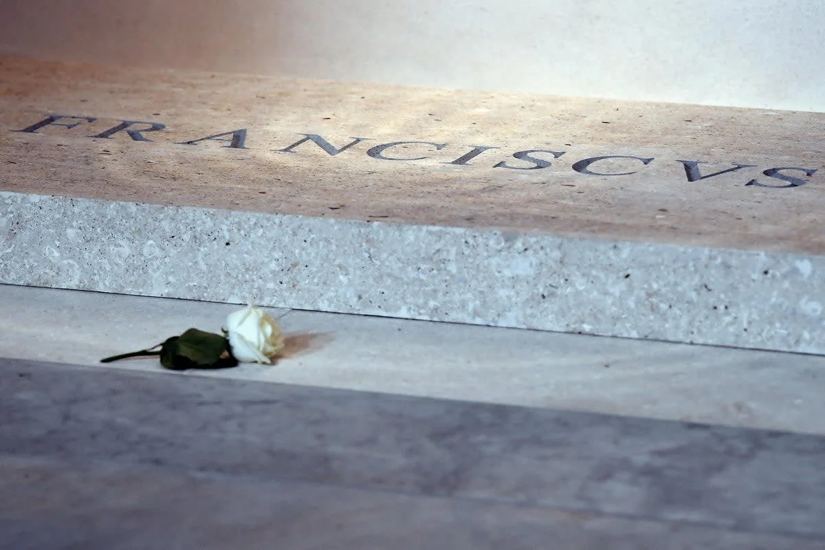
The problem is with the inscription on his stone. According to the Pope’s wishes, it is inscribed FRANCISCUS, the Latinate version of his ecclesiastical name. No dates, no iconography, no extra anything. It would be fair to ask, how could they mess it up?
But mess they did, in the most obvious way. The issue is kerning, the spacing of letters within a word. This is a tricky business in any kind of typesetting, which is usually controlled for by the designer of a typeface. She builds her font set with a mathematical assist which never quite solves all the challenges of kerning. At some point, she needs to rely on her eye, and an intuitive sense of far-ness and near-ness, and what looks right on the page or on the stone. Some combinations are notoriously difficult. The letters T and A are hard to arrange, and the designer will build so-called kerning pairs to place them. This is a painstaking process that calls for masterful artistry. It’s the difference between a professional artist and a typesetting jerk.
I’m afraid that Francis drew the typographic short straw and came away with an inscription by a jerk. The letters F and R are reasonably well spaced, but there’s a wide open gap between the R and A. Then another instance of gaposis, and then a crowded scrum, without breathing space between the next five letters. The last two letters are a hopeless little appendage which seems to have nothing to do with the rest of the name.
Designers with much more skill than I have run this job through a buzz saw of mockery. One suggested that if you press the A, you’d open up a golden chamber of Vatican treasures. They’re split on the appropriateness of the typeface itself. You might recognize it as a version Times Roman, a work-horse font whose chief distinction is a kind of plebian utility on the level of a phone book. I personally regard it as one step up from Comic Sans.
What’s clear is that all of this has to go. It needs to go fast, before the next Pope turns 70. Forgive me for going on and on, but there are some offenses that cross the boundaries of faith. I am, admittedly an outsider looking in, but this rabbi says that Pope Francis deserves better.